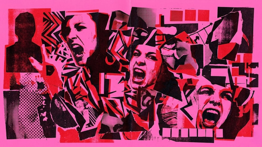
A defence of maximalism in a world of beige
Somewhere around 2015, the entire design industry collectively decided that the highest aspiration a visual could achieve was to contain as little as possible. White space became holy. Sans-serif became scripture. "Less is more" became the mantra chanted by creative directors, brand strategists, and startup founders who had just discovered Dieter Rams and were suddenly very passionate about restraint.
And look, it worked. For a while. In a landscape choked with visual noise, the brands that stripped everything back felt like a glass of cold water. Apple understood this. Muji understood this. A generation of designers who grew up studying Swiss typography understood this profoundly, and they were right to pursue it.
The problem is what happened next. Everyone pursued it. Every brand. Every startup. Every SaaS company. Every DTC skincare line. Every restaurant menu, coworking space, and podcast website. Minimalism went from being a deliberate aesthetic choice to being the default setting for "I want to look professional," which is how a philosophy built on intentionality became the most unintentional design decision in modern history.
Minimalism became beige. And beige, by definition, is the colour you choose when you've decided that disappearing is safer than being seen.
The Minimalism Industrial Complex
The infrastructure that supports minimalism is staggering. Squarespace templates. Figma component libraries. Brand guidelines that specify exactly how much empty space must surround the logo at all times. Design systems optimised for consistency, which is a polite way of saying optimised for sameness.
This infrastructure exists because minimalism is easy to systematise. A minimalist brand identity can be documented in a twelve-page PDF and executed by anyone with access to the right font files. The rules are simple: lots of white space, one or two colours, clean typography, and remove anything that feels "busy." The result is a brand that looks expensive, feels considered, and is absolutely indistinguishable from the four thousand other brands that followed the same twelve-page PDF.
The minimalism industrial complex rewards compliance. It punishes deviation. It has turned "clean" into a synonym for "correct" and "maximalist" into a synonym for "amateur." These associations are cultural constructs, built over a decade of design blogs, portfolio sites, and award shows celebrating the same aesthetic over and over until it calcified into orthodoxy.
Orthodoxies are made to be broken. That's practically their biological function.
What Minimalism Actually Communicates
Every design choice communicates something. Colour communicates. Typography communicates. Layout communicates. And the absence of these things communicates too.
When minimalism is deployed with genuine intention, with a specific story to tell and a deliberate reason for restraint, it communicates confidence. Quiet authority. The visual equivalent of a person who walks into a room and says very little because they know everyone is already paying attention.
When minimalism is deployed as a default? It communicates something entirely different. It communicates caution. It communicates "we looked at what successful brands do and copied the surface." It communicates the visual equivalent of a person who says very little because they have very little to say.
The audience reads both versions instantly. They may lack the design vocabulary to articulate the difference, but they feel it. Intentional restraint has a gravitational pull. Default restraint has the energy of an empty room where the furniture was removed because someone thought it would look more "modern."
The Case for More
Maximalism is the philosophy of abundance. Of filling the frame with purpose. Of trusting the audience to process complexity and rewarding them for the effort. It is the visual language of confidence so thorough that it spills over the edges, because the story being told is too rich, too layered, too alive to be contained in a single colour palette and fourteen words of body copy.
Consider the brands and cultural artefacts that have endured across generations. Versace. Gaudí. Wes Anderson. Japanese street fashion. Mexican muralism. Indian wedding invitations. Baroque churches. Hong Kong neon. The opening credits of a Baz Luhrmann film. Every one of these is maximalist to its core, dense with detail, saturated with intent, and absolutely impossible to confuse with anything else on earth.
That last quality is the one that matters most. Maximalism, executed with skill and taste, produces work that is unmistakable. You see it once and you know exactly who made it. The visual density creates a fingerprint so complex that imitating it would require someone to steal your entire worldview, which is a significantly harder task than copying your font choice.
Minimalist brands can be replicated in an afternoon by anyone with a Figma account. Maximalist brands require years of accumulated creative decisions, layered on top of each other like geological strata, forming something that is genuinely unique because it was genuinely built over time.
The Myth of "Busy"
The primary objection to maximalism is that it's "busy." That it overwhelms. That the audience will be confused by too much information and retreat to the comfortable arms of a brand with more white space and fewer ideas.
This objection reveals a profound underestimation of the audience.
Human beings process staggering amounts of visual information every waking second. We navigate cities. We read faces. We parse crowded environments full of competing stimuli and extract meaning from chaos with effortless sophistication. The idea that a person capable of crossing a Tokyo intersection will be "overwhelmed" by a website with more than two colours and a background texture is, frankly, insulting to the species.
"Busy" is what happens when maximalism lacks hierarchy. When every element screams at the same volume and the eye finds zero entry point, zero flow, zero narrative path through the density. That's poor execution, and it exists in minimalism too. A minimal layout with weak hierarchy is just as confusing as a dense one. It just looks quieter while it confuses you.
Great maximalism has impeccable hierarchy. It guides the eye through layers of detail, rewarding attention at every level of engagement. The first glance delivers the headline. The second glance reveals the texture. The third glance uncovers the Easter eggs, the details that make someone lean in and say "oh, that's clever." Every layer is intentional. Every element earns its place in the composition.
This is harder to execute than minimalism. Significantly harder. Which is precisely why so few brands attempt it, and precisely why the ones that do stand out like fireworks at a funeral.
Maximalism as Strategy
The strategic argument for maximalism is embarrassingly simple once you see it.
In a landscape where the overwhelming majority of brands have adopted a minimalist visual language, minimalism has become invisible. It's the visual equivalent of speaking at the same volume and pitch as everyone else in a crowded room. You can deliver the most brilliant sentence ever constructed, and it will vanish into the ambient noise because the delivery is indistinguishable from everything around it.
Maximalism is the equivalent of singing. In a room full of people talking, the person who sings gets every head to turn. The content of the song matters, obviously. Singing off-key about emptiness is just noise. Singing well, with purpose, with skill, with a melody that sticks? That is how you become the only thing anyone remembers about the room.
This is where the strategic conversation about maximalism begins. It begins with the recognition that differentiation is the entire game, and that the dominant aesthetic in your competitive landscape is the one thing you should absolutely avoid matching.
If your competitors are all minimal? Go maximal. Fill the frame. Layer the textures. Use the colours they're too timid to touch. Hire the illustrator. Commission the custom typography. Build the visual world that your audience will recognise across every touchpoint, because every touchpoint is dense with detail that only your brand would produce.
The Craft Requirement
Maximalism demands more of everyone involved. More from the designer, who must manage complexity while maintaining clarity. More from the art director, who must ensure every element serves the narrative. More from the client, who must trust that density serves a purpose and that the audience is sophisticated enough to receive it.
This higher craft requirement is exactly why maximalism works as a competitive strategy. It creates a natural barrier to imitation. Any competitor can adopt your minimalist aesthetic in a weekend. Matching a maximalist visual system requires months of creative development, a deep understanding of your narrative architecture, and the taste to know which details elevate and which details clutter.
The brands that invest in this level of visual complexity reap a specific reward: recognition. The audience builds a visual vocabulary around your brand. They learn to read your layers. They develop a relationship with your aesthetic that deepens over time, the way a viewer's relationship with a Wes Anderson film deepens on every rewatch. Each viewing reveals new details. Each encounter with the brand delivers something the previous encounter missed.
This is how brand loyalty gets built at the visual layer. Through richness, through reward, through the implicit promise that paying attention to this brand will always yield something worth finding.
The Courage Gap
The reason most brands default to minimalism has very little to do with aesthetics and everything to do with psychology. Minimalism is safe. A minimal design is unlikely to offend anyone, alienate any demographic, or generate the kind of strong reaction that keeps a marketing VP awake at 2am wondering if the rebrand was a mistake.
Maximalism requires the willingness to be seen. Fully, loudly, unapologetically seen. It requires the confidence to fill a space with your vision and trust that the right audience will respond, while accepting that the wrong audience will scroll past. It requires the same courage that separates a magnetic public speaker from a competent one: the willingness to take up space, to be specific, to commit to a delivery that is unmistakably yours.
This courage gap is the real barrier to maximalism. The craft can be learned. The tools exist. The talent is available. What's scarce is the institutional bravery to look at a dense, layered, visually rich concept and say "yes, this is us" when every instinct trained by a decade of minimalist orthodoxy is screaming "maybe we should simplify."
The brands that close this gap are the ones that build genuine visual identities. Identities that are felt, remembered, and sought out. Identities that function as creative signatures so distinctive they become part of the cultural landscape.
The ones that stay in the gap? They'll keep producing beautiful, polished, utterly forgettable work that disappears into the infinite scroll of sameness. And they'll keep wondering why.
The Bottom Line
Minimalism had its era. It was the right correction at the right time, a necessary antidote to the visual chaos of the early internet and the clip-art aesthetic of the mid-2000s. It taught designers the value of restraint, the power of white space, and the discipline of intentional reduction.
That lesson has been learned. Thoroughly. By everyone. Simultaneously. To the point where the lesson itself has become the problem.
The next era of memorable brand design belongs to maximalism. To the brands brave enough to fill the frame, layer the detail, and trust their audience with visual complexity. To the studios that can manage density with precision and build visual worlds so rich they become impossible to replicate.
We happen to be one of those studios. And we've been waiting for the rest of the industry to figure this out.
Welcome to the other side of the pendulum. It's louder here. It's denser. It's more demanding.
It's also a lot more interesting.